Did you have any difficulties organizing, aggregating or summarizing your data?
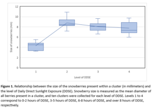
I did not encounter difficulties organizing my data per se; however, summarizing it and choosing what information to include in my figure was challenging. I ended up creating a boxplot that illustrates the relationship between the size of berries and the level of daily direct sunlight exposure (DDSE). I found the boxplot to be an interesting and clear way to synthesize the data and show how the amount of DDSE influences berry size.
When I was looking at my raw data, I thought that the difference of berry sizes between level 3 and 4 would be larger. This simply demonstrates that plots are very useful in visualizing the relationship between two variables, even more so than tables (my raw data was organized in tables). This also shows that snowberries seem to grow larger in a moderate amount of DDSE. Perhaps increasing the size of my data set would have produced a slightly different, but more accurate relationship between the two variables.
Looking back, I think that I could have used a dotted graph instead, which may have presented the data in a more simple (but just as effective) form. While boxplots are great to show parameters such as minimum and maximum values, the mean, and the interquartile range, this may also overcomplicate the figure.