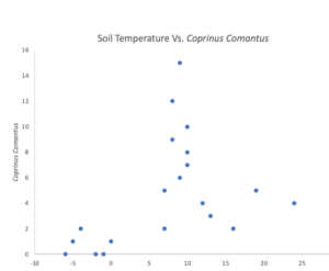
My graph shows the relationship between soil temperature and Coprinus comatus (shaggy mane) abundance it shows the optimal range at which the shaggy mane abundance was as well as the temperature at which shaggy mane abundance declined. While recording my samples, I thought my graph should be represented with a line graph, so I had struggled initially trying to show my data through the line graph. I tried multiple graph designs and realized that the scatter plot summarized my field research hypothesis and predictions. The abundance of shaggy mane mushrooms exhibited a distinct peak between 8 and 10 degrees Celsius, corresponding to optimal soil temperature conditions for fungal growth. At lower soil temperature ranges, I noticed a gradual decline in shaggy mane abundance, indicating potential ecological thresholds or limiting factors at play. Conversely, at higher temperatures, I observed a decline in abundance, suggesting the influence of temperature stress or competitive interactions.
The data not only provided valuable insights into the relationship between soil temperature and shaggy mane abundance but also sparked ideas for future exploration. One avenue for further research could involve investigating the mechanisms driving the observed temperature thresholds and their ecological implications for fungal communities.
Furthermore, exploring the interactive effects of additional environmental variables, such as moisture levels and substrate availability, could offer a more comprehensive understanding of fungal ecology. Additionally, incorporating long-term monitoring efforts and experimental manipulations could elucidate the dynamics of fungal responses to climate change and ecosystem disturbances.
I already marked your graph small assignment, see comments there for feedback