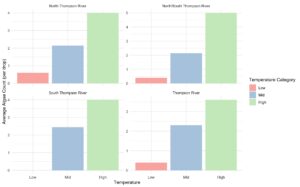

Above are the 2 graphs that I made for my project I had some issues with filtering my data. Because in my dataset I had Dates, Sites, Temperatures and Algae there was to many variables to just simply made a graph with the original dataset. I ended up filtering out the dates as they weren’t explanatory or predictor variables in this experiment. I also grouped Temperature into low, mid or high to simplify things and by taking my temperature which was numerical and converting it to categorical I was able to plot my data as a boxplot and have one graph per site making it easy to visualize how temperature effects algae in the 4 different sites. I also made a scatterplot for my regression graph which shows the positive relationship between temperature and algae. The regression included all the data points and I filtered out sites and dates as those were not relevant in the linear regression analysis.