LnRiLWZpZWxke21hcmdpbi1ib3R0b206MC43NmVtfS50Yi1maWVsZC0tbGVmdHt0ZXh0LWFsaWduOmxlZnR9LnRiLWZpZWxkLS1jZW50ZXJ7dGV4dC1hbGlnbjpjZW50ZXJ9LnRiLWZpZWxkLS1yaWdodHt0ZXh0LWFsaWduOnJpZ2h0fS50Yi1maWVsZF9fc2t5cGVfcHJldmlld3twYWRkaW5nOjEwcHggMjBweDtib3JkZXItcmFkaXVzOjNweDtjb2xvcjojZmZmO2JhY2tncm91bmQ6IzAwYWZlZTtkaXNwbGF5OmlubGluZS1ibG9ja311bC5nbGlkZV9fc2xpZGVze21hcmdpbjowfQ==
IEBtZWRpYSBvbmx5IHNjcmVlbiBhbmQgKG1heC13aWR0aDogNzgxcHgpIHsgICB9IEBtZWRpYSBvbmx5IHNjcmVlbiBhbmQgKG1heC13aWR0aDogNTk5cHgpIHsgICB9IA==
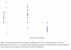
For my data, I created a graph that clearly shows the difference between the number of pollinators present in the disturbed versus the undisturbed lawns, which is the main basis of my research. The outcome is as I expected, however, when analyzing the data I noticed that there was an obvious decline in pollinator numbers with an increase in wind speed. This could be an interesting idea for further exploration.
great to note future study ideas, or things that weren’t accounted for in the research.
about the table, it is very clear with the predictor variable on the x axis
I would suggest adding a sentence about what the blue dots are (observations), and change the labels to undisturbed and disturbed from the numbers. You can still explain in the text what each is defined as. I like lots of text in figures and tables (think three sentences or so) so this is a great start!