LnRiLWZpZWxke21hcmdpbi1ib3R0b206MC43NmVtfS50Yi1maWVsZC0tbGVmdHt0ZXh0LWFsaWduOmxlZnR9LnRiLWZpZWxkLS1jZW50ZXJ7dGV4dC1hbGlnbjpjZW50ZXJ9LnRiLWZpZWxkLS1yaWdodHt0ZXh0LWFsaWduOnJpZ2h0fS50Yi1maWVsZF9fc2t5cGVfcHJldmlld3twYWRkaW5nOjEwcHggMjBweDtib3JkZXItcmFkaXVzOjNweDtjb2xvcjojZmZmO2JhY2tncm91bmQ6IzAwYWZlZTtkaXNwbGF5OmlubGluZS1ibG9ja311bC5nbGlkZV9fc2xpZGVze21hcmdpbjowfQ==
IEBtZWRpYSBvbmx5IHNjcmVlbiBhbmQgKG1heC13aWR0aDogNzgxcHgpIHsgICB9IEBtZWRpYSBvbmx5IHNjcmVlbiBhbmQgKG1heC13aWR0aDogNTk5cHgpIHsgICB9IA==
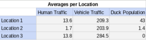
When organizing and aggregating my data I was able to simplify my 30 replicates into a simple table that broadly describes the overall activity at all three locations in my study. This makes the overall trend of duck population being directly related to human traffic and inversely related to vehicle traffic. This presents a reality that was expected and predicted. The data hasn’t yet revealed anything that was unexpected or new.
Hello
Be sure and add Table 1: some text at the top
you can be specific about what was recorded – so human traffic is individual people? and vehicles are driving by? that kind of thing can be defined in text.
be sure and discuss outliers to the average somewhere in the paper – perhaps a bar chart with bars showing range of data might work here too